
Back to Basics
 As most Tribe fans know by now, the new “alternate” uniforms were announced last week (coincidentally just in time for Black Friday and the holiday shopping season). As the only known DiaTribe regular who is a paying member of www.uniwatchblog.com, our fearless leader asked me, Little ol' T-Bone, to step in and to talk about the changes, which I'll do in entirely too much detail. Be forewarned.
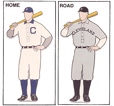
The new threads represent a “back to basics” approach, as not only are the new alternates your traditional “throwback” jersey, but some slight changes were made to the regular home, away, and blue alternate jerseys as well to give them a cleaner look.
Here's Kenny in times of red and then in blue:

Now I cant find it documented anywhere, but back in 2002 I’m nearly positive it was noted by Indians' brass that the silver was added to help merchandising. Sure enough, what did they do last week? They took away the silver accenting to get away from the “retail look,” as I heard Bobby D say on a local morning show.
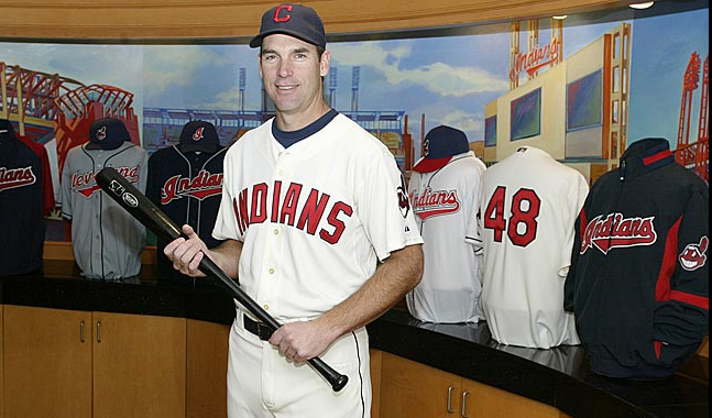
The new alternate is your traditional “throwback” jersey, and was spearheaded by none other than 2007 Sporting News Executive of the Year Mark Shapiro himself.

The indians.com story states “the block lettering harkens back to the 1960s, the coloring is similar to that of the late 1940s and the block "C" is reminiscent of the early 1900s.”
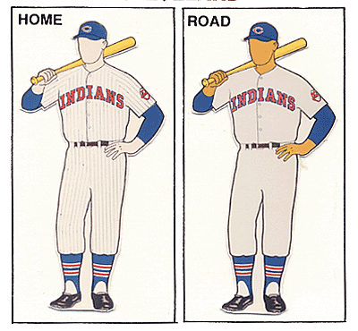
The “coloring similar to that of the late 1940s” indeed shows similarity, as seen here in the 1944 uniform (note: if they sported these stirrups with the new alts, I’d be in heaven):
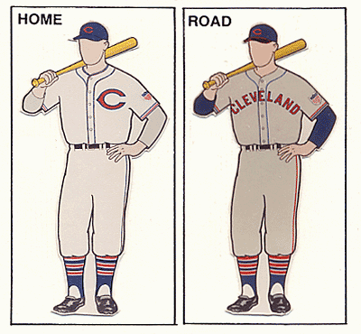
I also think the new gear bears a resemblance to the 1971 outfit, sans pinstripes:
It should be noted that the

Names will be absent on the back of the jerseys, which I don’t mind at all. If you don’t like it, hey, at least now you wont have to worry about having the jersey of a guy who left because his wife is his “rock” and “it comes down to winning,” right? (no names, please)
As seen at the top, Chief Wahoo remains on the left sleeve, and since I’m firmly in the “they’re phasing out the Chief and I’m not happy about it” camp, I loved seeing the following quote from Kurt Schloss, director of merchandising.
Compare that to new hat:

While I love the jerseys, I’m not so hot on these caps. They’re almost just too "plain Jane" for me. A simple, subtle white outline around the C could have done wonders. If the hat had to be Wahoo-less, I personally would have preferred to go back to the “Reds” C, which we used in some way, shape or form on cap or jersey from 1933 to 1972. That being said, I’m guessing the new alt cap will grow on me and I’ll have one by mid-February.

The only other thing I’m disappointed in is that they had a chance to correct the many shades of blue used in all aspects of the uniform, and get it down to just one stinkin' hue of blue. To me at least, it seems the hats are one shade (lightest), the blue jerseys another (slightly darker), the piping on home and away are another (darker), the helmets are another (even darker), and now the alt caps are yet another (comparable to helmets). It’s been bugging me since 2002, and looks to continue to do so for the foreseeable future. And yes, I know I’m crazy.
OK, I’ll stop here before you go and commit me to an institution for all this nonsense. The good thing is I realize I have a problem, and have a focus group to report to each morning around 10:30 a.m.
Although I hear the alt jerseys and caps are available in team gift shops, only the caps are online as of this minute. Grab ‘em now while you can!


6 comments:
Huzzah T-Bone!
Fantastic stuff and opinions of which I am all aboard with, notably the myriad of blues driving me nuts (just pick one) and the fact that the new cap should DEFINITELY have a white stripe around the C.
I've gone on record that I'm a BIG fan overall on the new unis, though the cream color concerns me as I'm afraid they're going to end up looking like the SF Giants ones that look yellowish.
We'll have to wait and see as my X-Mas list finally had some items added to it.
I saw the new unis at the team shop, and it is indeed yellowish. It actually makes me think of a sweat-stained undershirt.
I just don't care for these new uniforms all-around.
The Padres have the so-called cream colored uniforms and I don't care for them at all. The sweat-stained undershirt description seems apt.
give me good old white white anytime
I know that the team shop sells a Bob Feller T-Shirt jersey that's awesome, but the fact that it's off-white makes it look dirty and prevents me from buying it.
While anything's better than those vests, if the new unis come out like that (none of the pictures I've seen have thrown off that yellow), I'll be disappointed.
I still think the new caps would have looked better - all blue with a white outline for the red C - like this one with a blue bill.
You're not crazy for mentioning the rainbow of blues we have. I'm glad I read your entire piece since I was hoping that would be mentioned. It's just horrible and it bugs the hell out of me too.
Can we get the Tribe to comment on this?
I am afraid that this statement is not correct"Oddly enough, with most players getting the heck out of dodge for the offseason, your models for the unveiling ceremonies were coaches Joel Skinner and Derek Shelton.".
".I would appreciate if you can further elaborate this.Thank you.
baseball dvds.
Post a Comment