
Fit and (No) Trim
In lieu of anything related to player movement happening with the Tribe, there was a bit of news that broke as the Indians announced some tweaks to their uniforms, with the four jersey and hat combinations now available to the Tribe looking like this: The two on the ends are obviously the same as they’ve been for some time, with the big changes coming in the road grays and the new red hat that goes along with the Sunday “Creams”. Since I’ve devoted far too much time to this topic already (and here’s the post from last January that you want to click on before you continue), let’s dive into this a little bit as it seems that somebody down at Carnegie and Ontario was noticing my…ahem, suggestions.
To wit, here is the proposed new road uniform combination that I suggested back in January:

And the just announced new road uniform:
Soooo…if anyone wants my address so my “consulting fee” or some sort of royalty check can be sent for every time they sell one of these, just shoot me an e-mail…
Seriously though (and that was kind of serious), I’m a HUGE fan of the new road unis for obvious reasons and think that it represents a huge improvement and a return to a classy look, summed up by what I wrote back in January:
The script “Cleveland” on the road jerseys always felt like a little overkill to me as the script “Indians” is great in that it harkens back to the old uniforms of the 1940’s and 1950’s (to the right), but the script Cleveland comes off as a little forced. To me (and maybe just because I’m a child of the 1980s), I still think that the block “CLEVELAND” looked a lot better and cleaner, particularly in gray, before they fouled up the whole look with those racing stripes going up and down the arms and legs.
The one issue that I have with the new road unis (and you probably picked it up by the comparative photos) is that the Block “C” hat that they’ll be using with the road unis (and the “Creams”) is that it still doesn’t have the white outline that would finish it off so well. Am I alone in thinking that the trim makes a HUGE difference here?
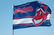
 As for the Red Hat, I suppose it represents another hat to sell and I’m not really all that against it as those Sunday “Creams” needed some dressing up to begin with and when they wore a Red Hat with the Sunday “Creams” as part of the MLB “Stars and Stripes” campaign (again, which is simply to sell more hats), it doesn’t look all that bad.
Again, however…where is the trim?
A sharp white outline around that blue block “C” would improve that hat immeasurably and would make it look like more than the unfinished project that came out as a result of the new uniform project:
 All told, the results are pretty solid…which makes sense because they were following the script laid out last January. Once they add that white trim (and it looked like they were going to on the front of the 2011 schedule), they’ll finally have this uniform thing pretty close to being locked down.
Now…back to those royalty checks or at least a consulting fee…


3 comments:
As they say in the start-up world, ideas are free :-)
Actually I agree with you. I think they look much nicer with the white trim.
But the red hats are pretty ugly.
I like the unis. The white trim would make them look better though.
Post a Comment