
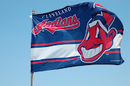
Uniformly Yours
With really nothing happening on the corner of Carnegie and Ontario all off-season, I thought that the lull presented a nice opportunity to tackle a mild obsession of mine – uniforms and, more notably, uniforms worn by the Cleveland Indians. Through the years, the Indians have always struggled to find the balance between history and freshness as, unlike most franchises, the Indians’ uniforms have undergone monumental changes with no one singular aspect remaining the same as fonts, color schemes, and even the Chief has seen major adjustments from era to era and year to year.
They’ve had pinstripes and every different “C” and font that you could think of. They’ve seen the blue in their uniforms change colors more frequently than the seasons and even dabbled (a couple of times) with making red their primary color. They’ve regrettably gone sleeveless and, more regrettably, made Boog Powell refer to himself as “the world’s largest bloody mary”, and through it all, they have yet to find that perfect combination of past and present, always stuck either attempting too hard to re-capture the past or to quick to look into the future.
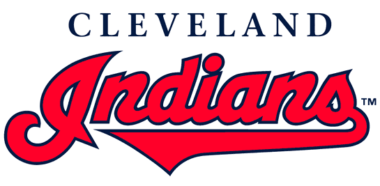
Thus, allow me to make a few suggestions as to what I would like to see the Indians’ uniforms look like with some of the changes being minimal as I do like the script INDIANS and just feel that the formula needs a little bit of tweaking. The most monumental change would come about in the hat that the Indians wore with their regular home and away uniforms with the return of the “Block C” hat, worn from 1978 to 1985 before the Indians went to all Chief, all the time. Lest anyone think that this is an attempt to remove the Chief altogether from the uniforms, fear not…it’s just one change that has always bothered me in that most of the Indians’ uniforms contain no mention or contain any symbol signifying the city that the team represents. That is, there is the obvious script “CLEVELAND” on the road jerseys (which is too much script for my taste, but we’ll get to that), but otherwise the Indians have Chief Wahoo and the stylized “I” that’s supposed to look like a feather…and that’s it. 
Nowhere is the “C” for Cleveland or any other symbol that represents our fair city. To that end, let’s introduce the first proposal to return to the “Block C” hat. The hat with the red brim would be worn with the current home whites and a new hat with a blue brim that would be worn with the new road uniforms, which I’ll get to momentarily.
For starters then, we’re looking at essentially the same home white uniforms but with a new “C” on the hat in an attempt to place “Cleveland” or at least the first letter on the hat. The “Block C” hat would also replace any more of the stylized “I” (meant to look like a feather) hats and would convey at least some city recognition as it would fall more in line with the “B” on the Red Sox hat or the “D” on the Tigers hat as it would be hard to imagine either of those teams wearing an “RS” in Boston or a “T” on their hats in Detroit. Similarly, let’s do away with the featheresque “I”, keeping it on the jersey in the context of the whole word and incorporate some hometown pride into the mix with the net result (with apologies for my admittedly poor PhotoShop skills) looking something like this, with Mr. Jeremy Sowers modeling:
Nothing too radical or earth-shattering, but rather simply an attempt to get the “Block C” back into circulation on the home whites, something that could also be done with the road uniforms. That being said, and before building a new road uni, this is what the current ones look like on a reliever who has just likely given up a long HR:
 As I said before, the script “Cleveland” on the road jerseys always felt like a little overkill to me as the script “Indians” is great in that it harkens back to the old uniforms of the 1940’s and 1950’s (to the right), but the script Cleveland comes off as a little forced. To me (and maybe just because I’m a child of the 1980s), I still think that the block “CLEVELAND” looked a lot better and cleaner, particularly in gray, before they fouled up the whole look with those racing stripes going up and down the arms and legs. Thus, I'd go with the “Block C” hat with the blue brim and the plain gray road uniforms with the Block “Cleveland”, with each looking something like this:

While these could certainly be taken as “boring” or nothing too fancy, I think that they’d represent an upgrade over the current road uniforms and if the Indians wanted to dress them up at all, perhaps they could incorporate the full Chief Wahoo (not just the face) in his batting stance that famously looked out from Municipal Stadium:
That might improve the look of the sleeve and give the uniform a little more flavor and the Chief getting ready for the pitch could be incorporated on the sleeves of both the home and road jerseys if it accomplished a little more variety than that big face smiling up from every bicep on the team.
As for the road alternates (that would also work as Sunday alternates to the new yellow…I mean cream uniforms that I do like), the Indians could replace the current blue road jerseys with the complementary top with the block Indians (shown below) to go along with the Block font and utilize the Chief Wahoo hat with the red brim as the complement to it, as it appears here (again, with apologies for the poor PhotoShop skills) on CP Lee a few years back:

Finally, given that the Block C hat would have worked itself back into steady rotation, I would incorporate the Chief hat into the current Sunday uniforms with the result looking something like this:
While some may immediately point to this as some sort of acknowledgment that a return to these uniforms is apropos as it signals a return to the type of baseball seen on the Lakefront in the 1980s. Rather, this exercise isn't meant to mean that a return to mediocrity is at hand at the corner of Carnegie and Ontario and embracing the mediocre past is just another step to that end. Instead, it’s a little shake-up and an attempt to incorporate the name of the city represented by the team into what the team wears.
What the team wears on the field is secondary to how it performs on the field, but in lieu of anything constructive to discuss concerning the performance-related questions this off-season, a discussion of the polyester-related questions is as good as anything these days.


7 comments:
I've always liked this "C", and almost bought this cap when I was in Cooperstown last summer.
Makes me think of Dennis Eckersley throwing a no- oh my... what is going on with this collar situation?
Anyway, I think they could use it with block home uniforms.
Don't they already use a block C hat with the new(er) home alternate unis? Or do you just mean that very specific Block C?
coz,
Yes, I meant that particular block C as the one that they currently wear with the yellow unis lacks the white outline around the C, which I think makes a huge difference.
I have never liked Block letter hats with Script uniforms or vice versa. The Block "C" with block "CLEVELAND" is a great idea for the road uni's, but leave the "Chief" and script "Indians" for the Home Whites!
Good stuff. The block "C" is definitely a contender. and the block navy blue alternate is a winner.
I took an amateurish stab at making a "C" logo that incorporated the feather.
http://sheahey.blogspot.com/2008/07/beating-throttling-pummeling-and.html
Looks like they took a little bit of your advice. This is the new batting practice cap they'll be wearing in 2010.
http://shop.mlb.com/product/index.jsp?productId=3875082&cp=3971623
I have this exact hat...red bill 'C' cap. Best hat I own...and would look wonderful in the Tribe's rotation.
Good post.
Post a Comment